

Judith Sutton ABR CRS IDS PMN ASP IAHSP SRES GREEN
Judy@JudithSutton.com 908 803-0472
EXPECT MORE
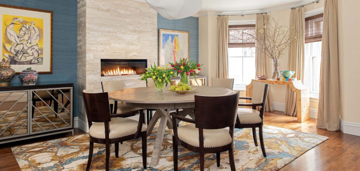
Start the Year with Bold Colors and Patterns
Key Takeaways:
- Homeowners are craving change and individuality, which means patterns and colors are making a bold comeback.
- Keep things simple, with one pattern as the “star” and other patterns and colors as supporting “actors.”
- Don’t be afraid to go bold. After all, that’s what patterns and colors were made for.
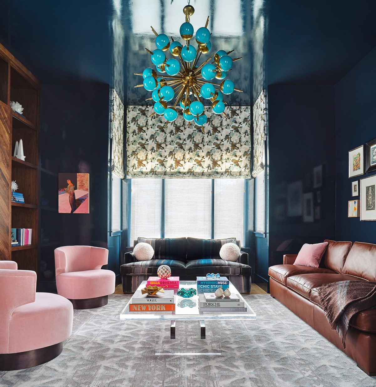
Neutral, solid colors have dominated interiors for years. Countertops, backsplashes, floors, walls, ceilings and upholstery boasted blocks of beige and myriad gray hues. Things are changing though. Many homeowners are eager to punch up their surroundings and go bold. Are you ready?
In addition to the now-tired, spa-inspired palettes of recent years, other reasons explain the current move toward exuberance. For starters, homeowners crave a change after the past two years. “Pattern adds excitement, personality and energy, and keeps a room from looking flat." The same can be said for the effect of vibrant color. Also, homeowners nowadays have less concern for what future buyers will think. Design for yourself and enjoy your space rather than for the person who may live there next. And just like less concern, there are also fewer rules about mixing motifs like stripes and plaid and colors on a room’s surfaces. Read on...
© Sean Litchfield
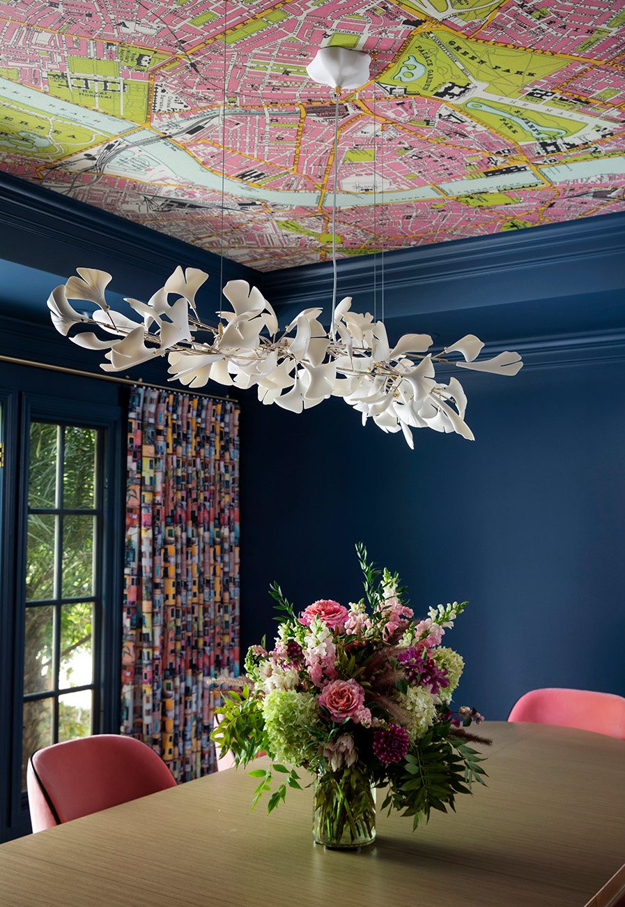
Experts vary on which strategy to follow. Some recommend trying out bolder patterns or colors in a limited way. Options include wallpapering a ceiling or installing patterned tiles behind a kitchen.
Some designers think otherwise. I believe that there’s a greater risk in dipping your toe into the pattern pond than there is to jump in head-first. When people are afraid, it shows—an accent wall, a colorful pillow on an otherwise beige sofa. These are amateur attempts that do more harm than good to the aesthetics of the room,” says Thornton, author of the design book, Wonderland: Adventures in Decorating (Rizzoli). She adds, “Fortune favors the bold. When I design rooms, I tell a story through the design and … that whisks guests off their feet onto a magical carpet ride.” (certainly not for everybody!)
She also believes that a trusted real estate salesperson can help. “A great real estate agent knows that differentiation is a selling point. When something is one-of-a-kind, it isn’t a commodity, and cost per square foot goes completely out the window for buyers,” she says. This is the emotional side of selecting a home you love!
Synthetic quartz has bolder “veining” that conceals stains and scratches. And wallpaper thickness has increased, which reduces tearing when hung and removed.
In using patterns and bold patterns today, the biggest decisions are how to choose from a vast array of options and mix them deftly. The finished look should appear fresh rather than dated. Design experts offer these tips to share with clients:
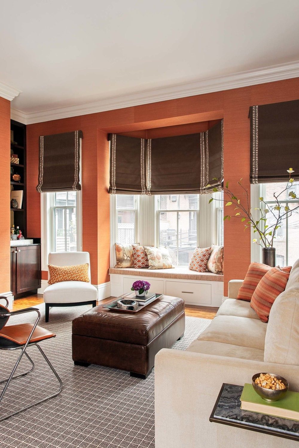
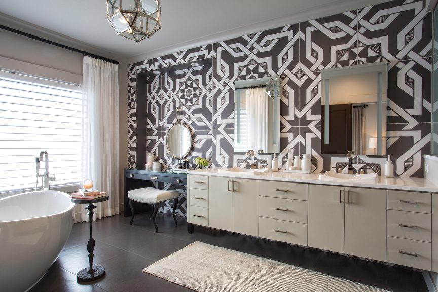
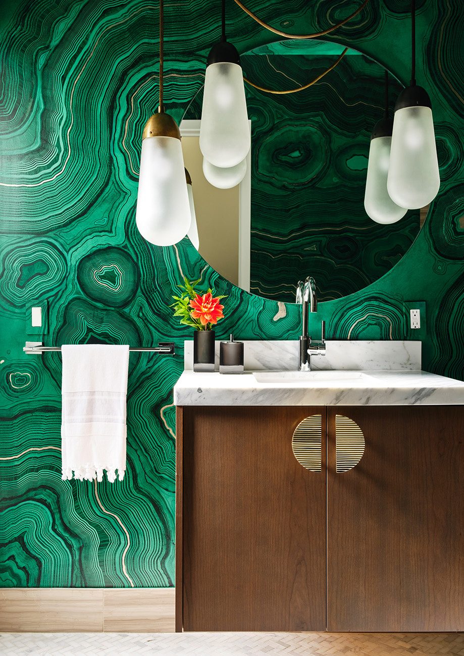
Be Bold, But Don’t Overdo It
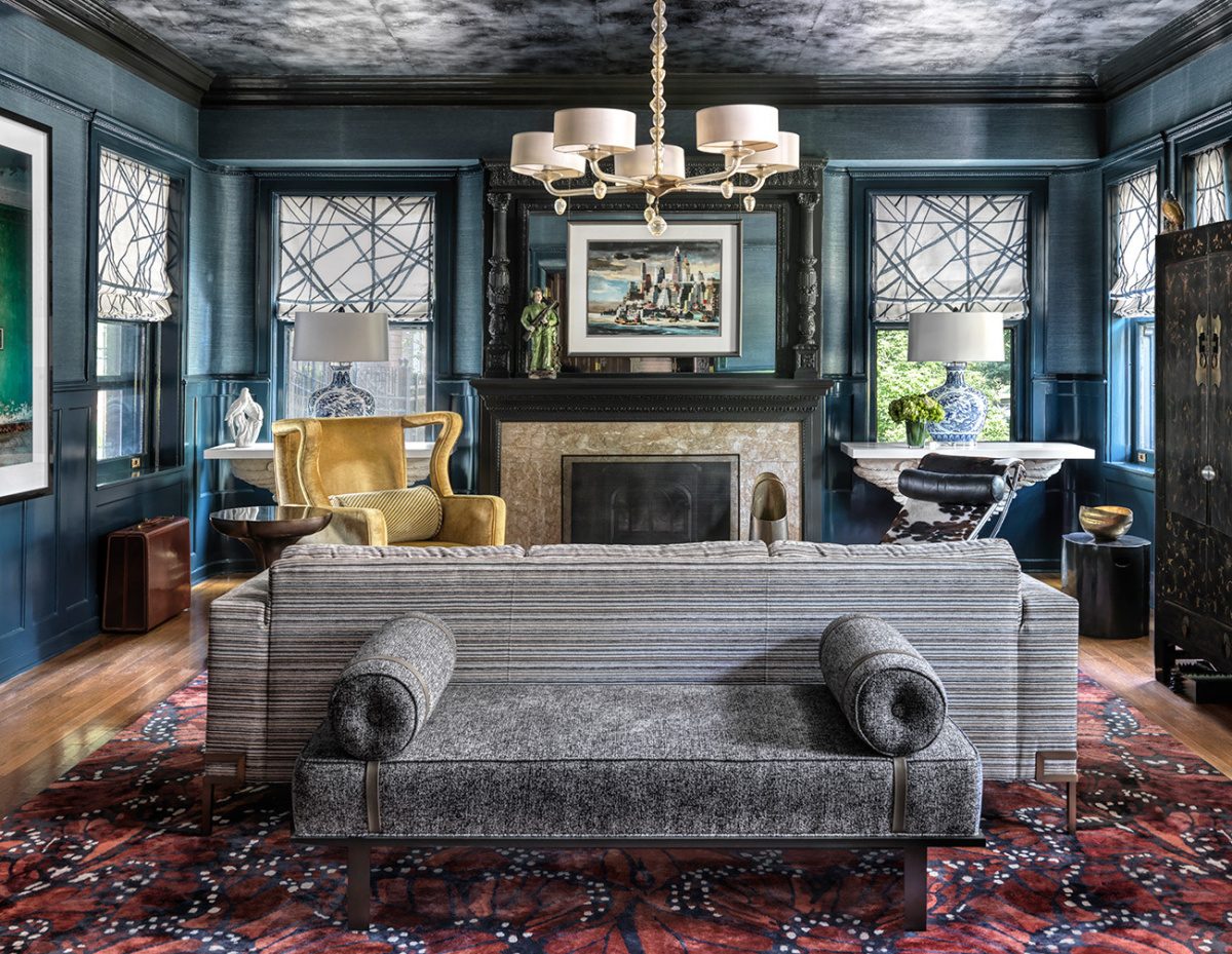
While more than one pattern and a few bold colors can visually work well in the same space, keep the mix to one bold pattern. Consider which pattern will operate as the star of the show, and use other patterns and colors as supporting characters. This works best.
Limit the number of patterns to three. For those who may be timid, it recommends starting with a classic herringbone or another subtle pattern in a single room such as a bedroom or dining room rather than covering a wide swath of shared space.
Balance the Scale
Homeowners who like the look of mixing different patterns might consider one oversized design and others on a smaller scale. Such as paisley patterns with a large 2½-inch repeat, rather than the tiny paisleys of prior generations. Some like to mix florals with geometrics, which is like pairing a plaid shirt with a floral skirt. Pogonitz combines large-scale trellis or chevron patterns with smaller circular designs. Offering a similar strategy: “If you like using florals, add in some curves or other geometrical patterns. 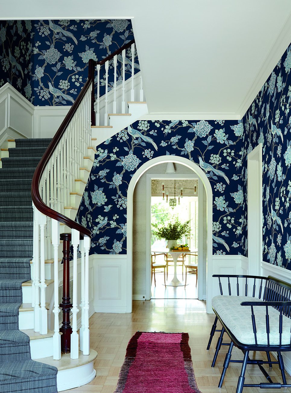

The key is not to repeat too many similar patterns. “Too much of one thing can be just too much.” The same or related colors can act as a common denominator to tie together the variety.
Contrast with Color
While some rooms might be unified by the same color in different areas, at other times some “clash is your friend,” says James Greenwood, brand and interior expert at wallpaper manufacturer Graham & Brown. As an example, he points to his company’s Jardin Magenta design, which contrasts monotone floral etchings and a magenta ground or field.
A great place to go bold is your powder room bathroom. This is a small space where you can show off using bold paint colors or a fun wallpaper. It’s not a huge commitment.
Offset Patterns with Solids and Classics
Solids aren’t totally passé. They offer a way to rest the eye and play up contrast. We like to accent big solid-colored furnishings with patterned rugs, decorative pillows, and blankets. “Striped patterns are always classic and can balance out another pattern (i.e., a floral).” Another way to help avoid dating a room is to pepper in some classic furnishings such as a mid-century Mies van der Rohe Barcelona chair or Vladimir Kagan sofa.
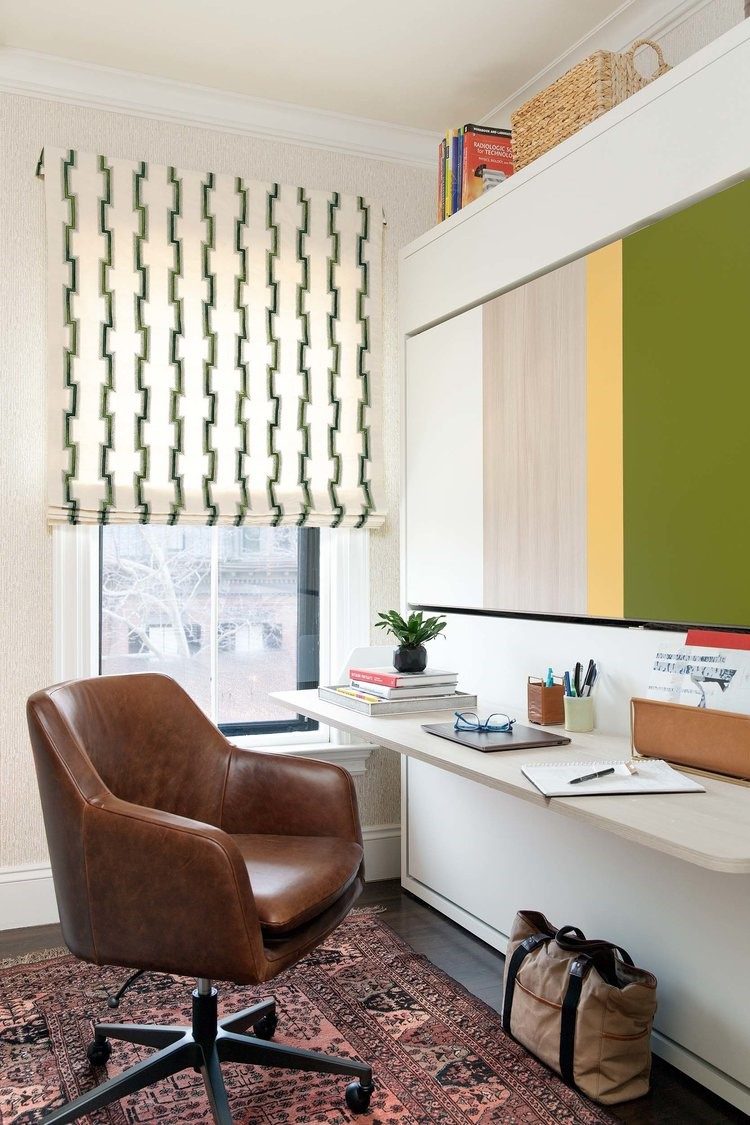
Don’t Forget Texture and Novel Shapes
Texture—in wallcoverings, rugs, pillows, and backsplash tiles—adds another dimension to a well-designed space. Decorators like to use ombre-dyed hand-knotted silk. Segal uses backsplash tiles with metal inserts. Baker loves grasscloth wallpaper, which is “classic, versatile, comes in many colors and adds depth to a room.”
Consider the Exterior
The outside of a house offers added surfaces where color, texture, and pattern can be introduced. Dzinly, an online design resource, recommends three to five complementary colors or materials in large cladding areas.
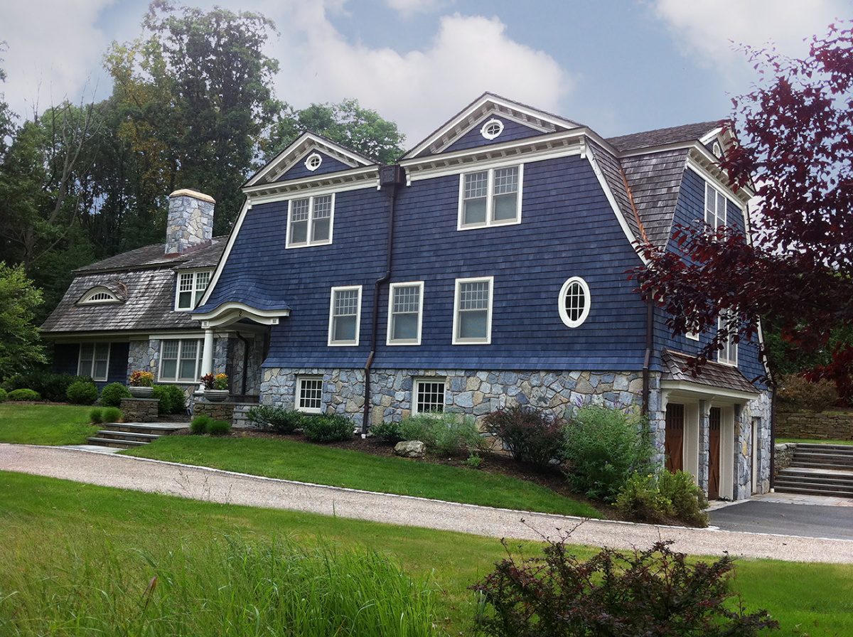
Color expert Amy Wax, founder of the Color911 app, doesn’t like to limit the number of colors but instead makes decisions based on a homeowner’s goal—whether they want an understated, elegant exterior or one that’s bold and outgoing. Overall, she finds more homeowners comfortable using color to make a statement and give their house a personal identity or say something visually about who lives inside.
Are you ready to make the Bold change? Don't you just love it?
"...smart advice...to help make smart decisions..."
908 803-0472
"...the right relationship means everything..."
SERVING THE SOMERSET HILLS AREA ONE CLIENT AT A TIME
Service & Experience
Since 1983
Remember: Nothing Is Forever
Changing designs may not be inexpensive but it’s not impossible when the next trend appears or homeowners tire of a look. Even removing wallpaper—once a laborious task—has become easier. “We studied how to make them release better from a wall and implemented a combination of paste and paper that make removal stress free.” Another option? Skip the wallpaper altogether. Use elements that are easier to switch out such as pillows, lamps, and accessories to add pattern and color. I am ready! Are you?
Need more advice from a Realtor's viewpoint? Call me and we can discuss it. There is nothing I love better than helping plan an exciting interior!